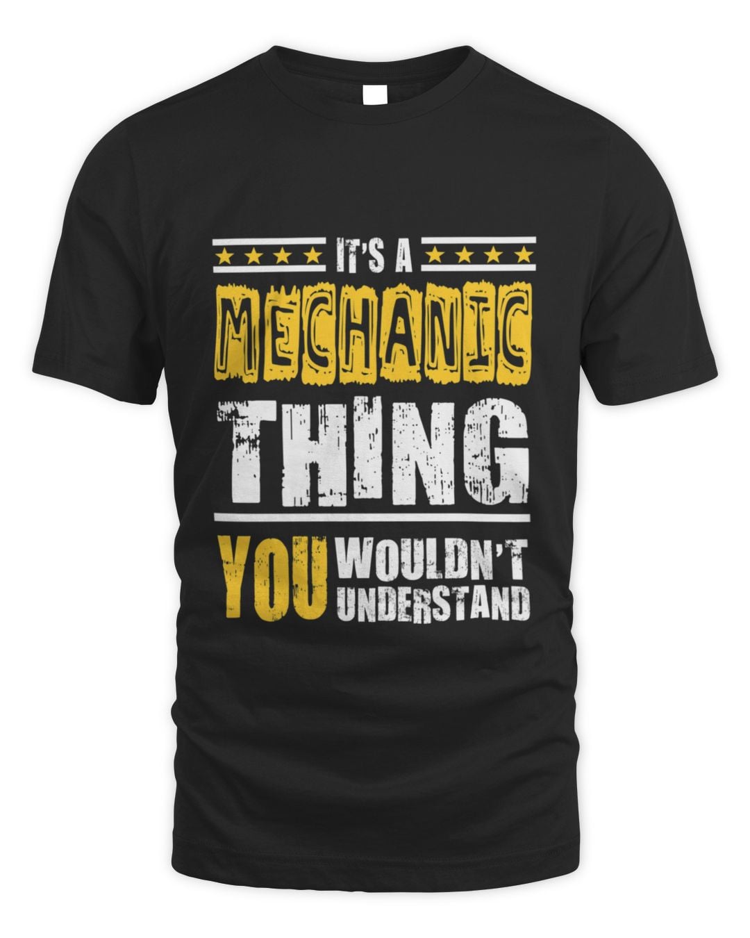
It's a Mechanic Thing You Wouldn't Understand
Unisex Standard T-Shirt
Clean lettering, no tools drawn in — the version that still looks right worn outside the shop.
$22.99
See details
6 designs of the same line, so you can pick the artwork rather than settle for the first one you find.
Clean lettering, no tools drawn in — the version that still looks right worn outside the shop.
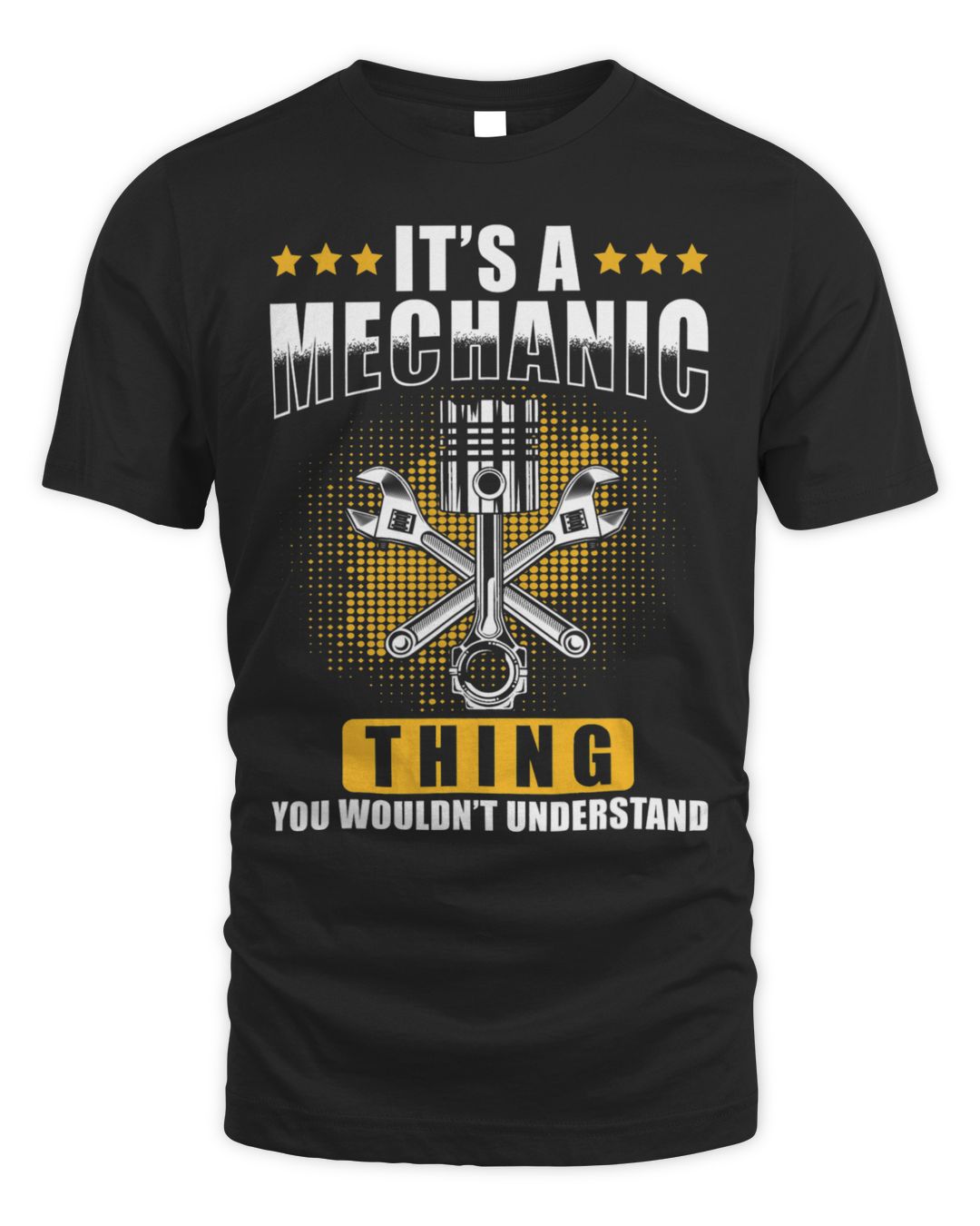
A dollar cheaper and heavier on the artwork. Dark colours here are the practical choice for a shirt that will meet grease.
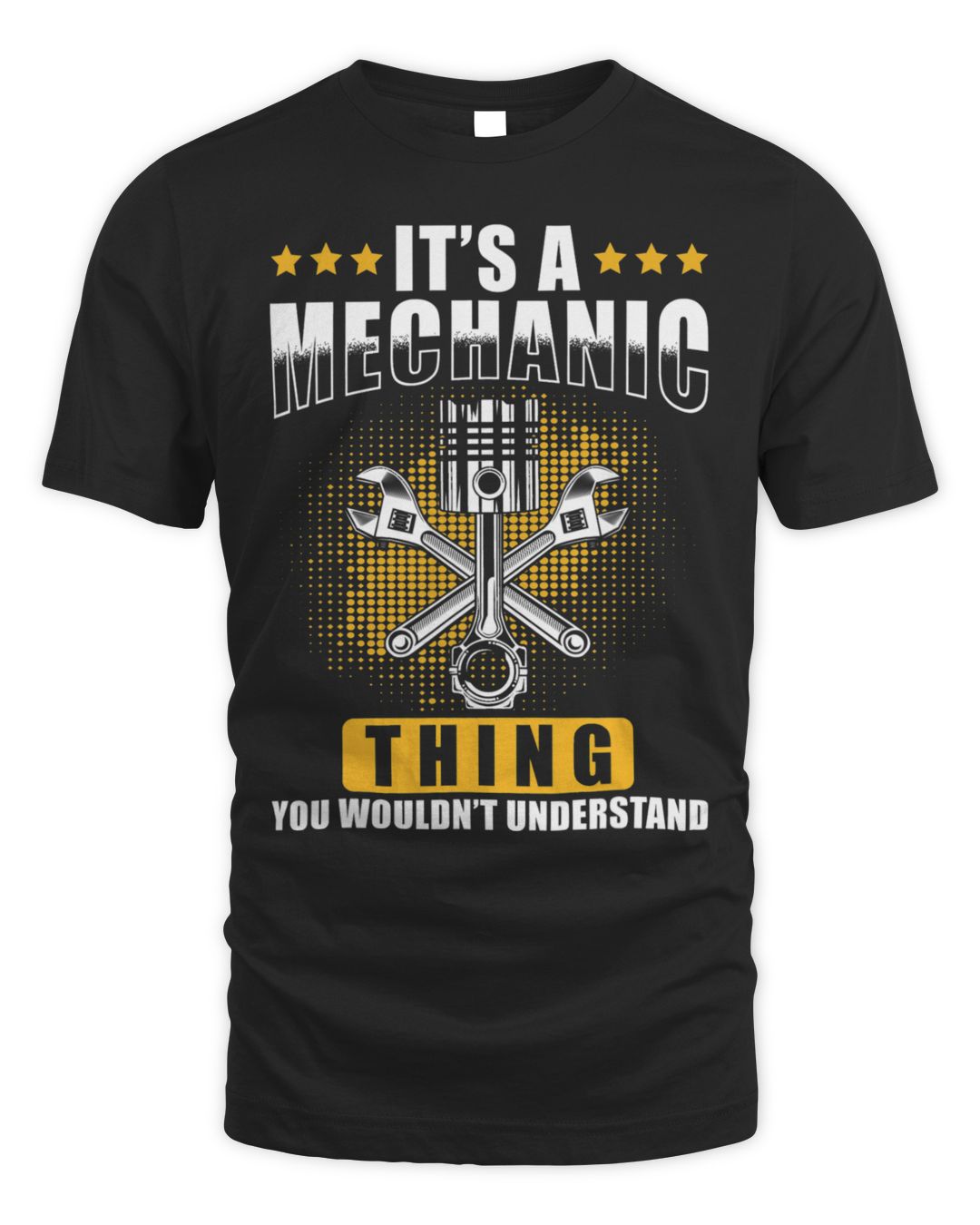
Same line, different type treatment. Worth comparing side by side before choosing.
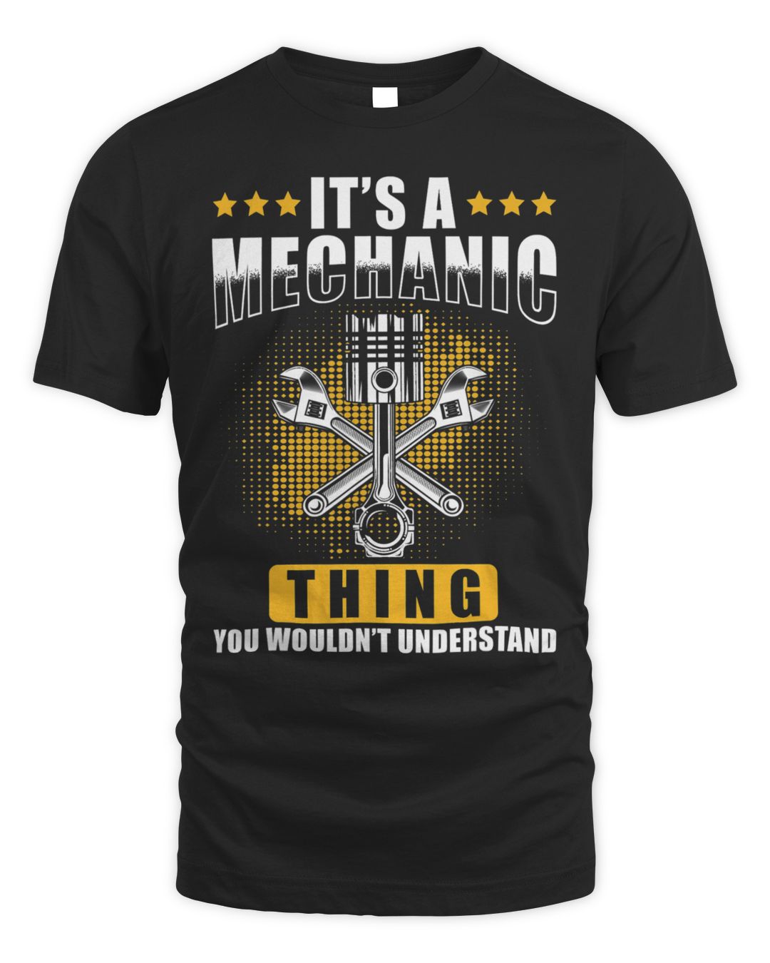
The loudest of the mechanic designs — legible right across a workshop floor.
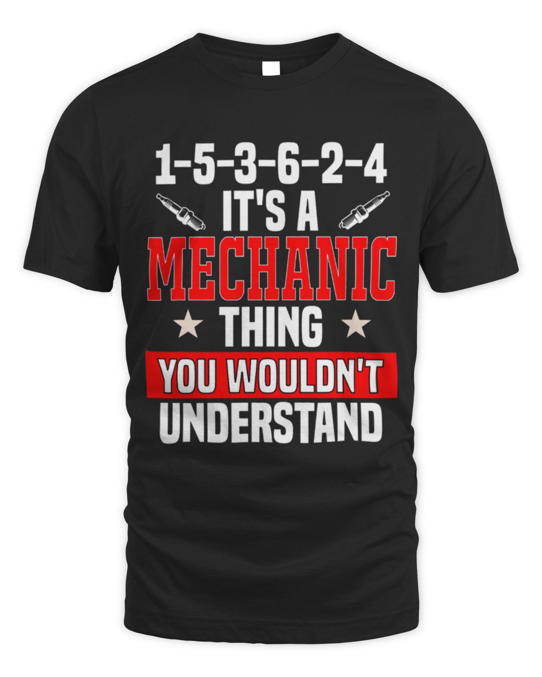
Engine-cylinder artwork worked into the line. The most specific of the six, and the one that lands hardest with someone who actually rebuilds engines.
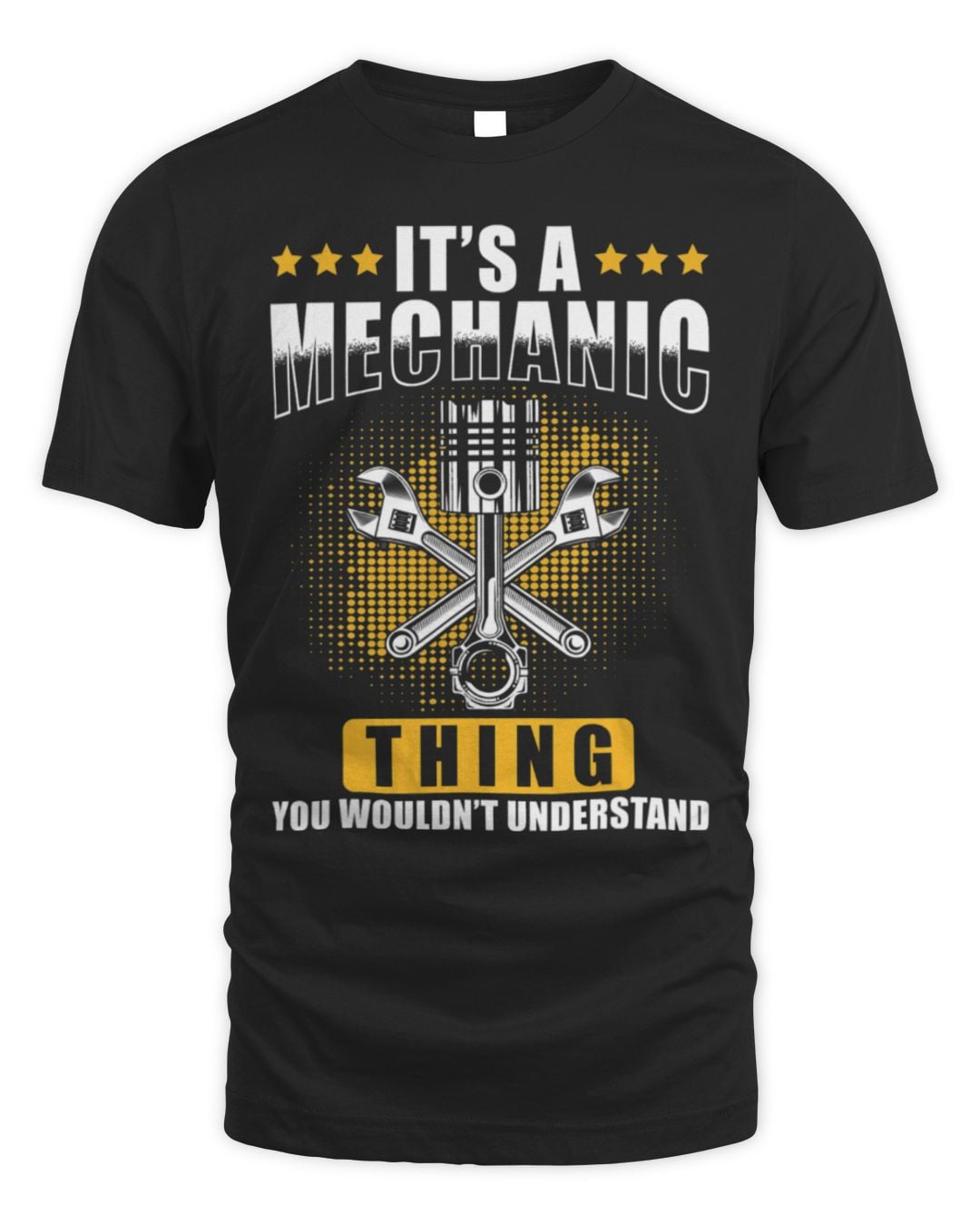
A softer illustrated take — the safer pick if you are buying for someone who does not wear slogan shirts often.
Trade and profession shirts are specific on purpose. Someone who says they are a mechanic will not accept a near-miss title, and the closely related jobs each have their own version — that precision is the whole point of the joke.
The 6 designs here all name the same job, so pick on how loud the artwork is. Anything worn to work should read cleanly at a glance rather than crowd the chest with a second punchline.
Best for someone a few years into the work — long enough that the job has its own vocabulary and its own complaints. For a new starter it can read as presumptuous, and for someone who has left the trade it reads as nostalgia rather than a joke.
The first is "can you just have a quick look at mine?", asked at a barbecue, about a noise the owner will now imitate. The second is whether the last garage ripped them off. Neither question has a good answer at a barbecue.
The other constant is hands. No mechanic has clean hands, and no amount of scrubbing changes that, which is why workshop shirts are bought to be ruined rather than kept.
Dark colours only. This is not a style preference.
The wording only works when it names the exact job, so it is worth checking before you buy. Med Surg Nurse, Miner and Nurse each have their own page with their own designs, and there are more below.

Join the TeeDuck list — new trending tees, hoodies, and seasonal gift guides. No spam.
🎉 Thanks for subscribing! Check your inbox for fresh picks soon.