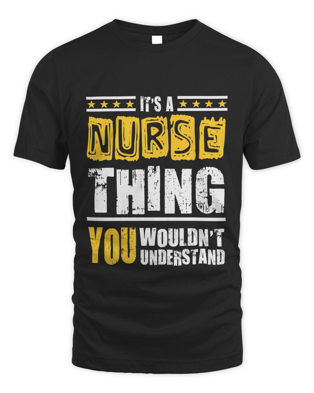
It's a Nurse Thing You Wouldn't Understand
Unisex Standard T-Shirt
The plain version — no specialty named, so it works for any nurse whose ward you are not sure of.
$22.99
See details
3 designs of the same line, so you can pick the artwork rather than settle for the first one you find.
The plain version — no specialty named, so it works for any nurse whose ward you are not sure of.
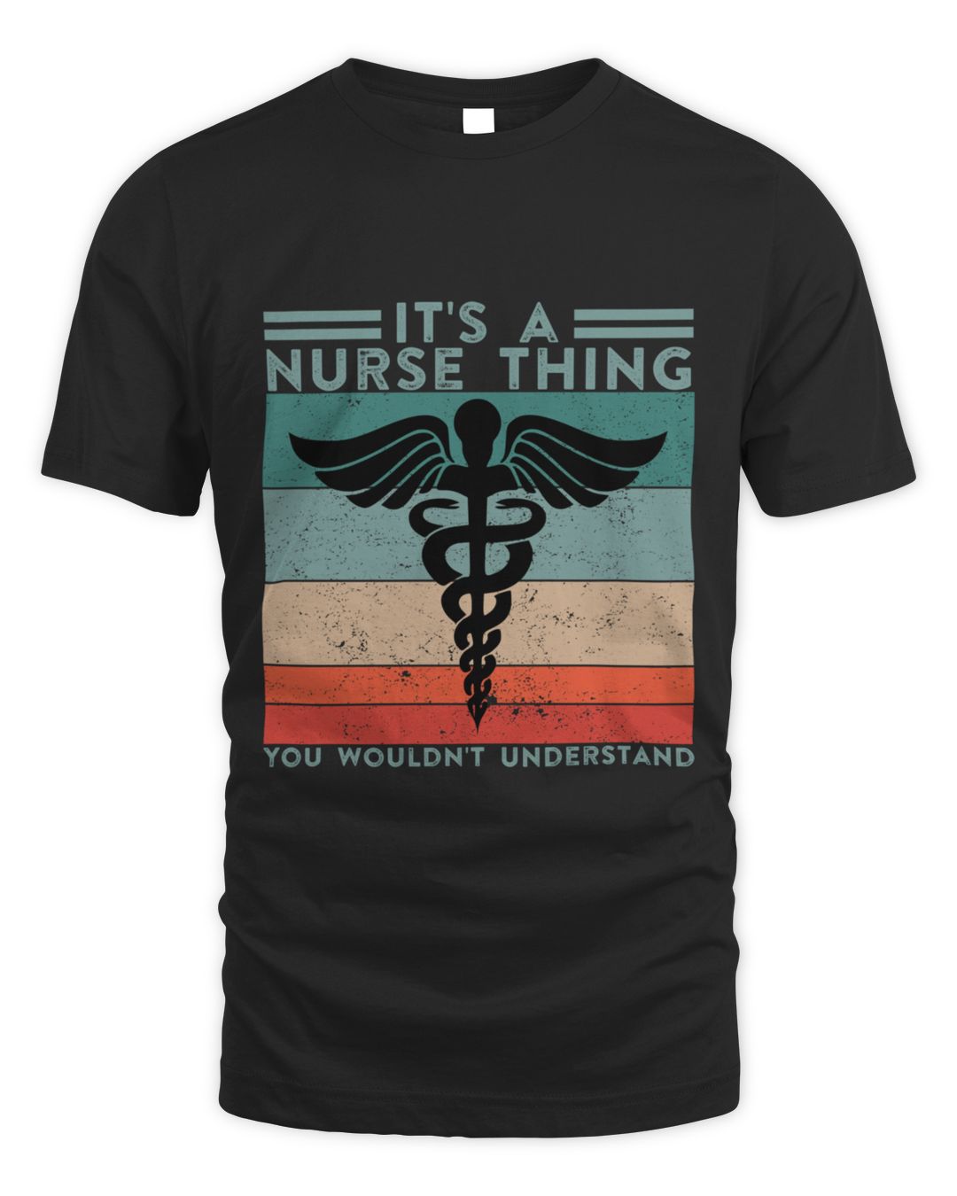
A bolder layout of the same line, cheaper by a dollar and easier to read across a ward.
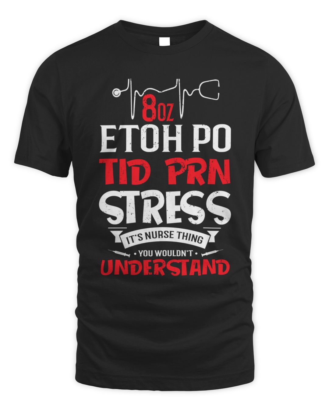
Built from real charting abbreviations, so it only lands with people who read them daily. The most in-group design here.
Trade and profession shirts are specific on purpose. Someone who says they are a nurse will not accept a near-miss title, and the closely related jobs each have their own version — that precision is the whole point of the joke.
The 3 designs here all name the same job, so pick on how loud the artwork is. Anything worn to work should read cleanly at a glance rather than crowd the chest with a second punchline.
Best for someone a few years into the work — long enough that the job has its own vocabulary and its own complaints. For a new starter it can read as presumptuous, and for someone who has left the trade it reads as nostalgia rather than a joke.
The single word "nurse" covers wards that have almost nothing in common. An ICU nurse, a theatre nurse and a community nurse do different work, keep different hours and are tired in different ways.
If you know the unit, buy the shirt that names it — there are pages here for several. The general one is the honest choice only when you genuinely do not know, and it reads that way.
The other constant is the shoes. Every nurse has strong views on footwear and has spent real money proving it.
The wording only works when it names the exact job, so it is worth checking before you buy. Optician, Pharmacist and Pharmacy each have their own page with their own designs, and there are more below.

Join the TeeDuck list — new trending tees, hoodies, and seasonal gift guides. No spam.
🎉 Thanks for subscribing! Check your inbox for fresh picks soon.