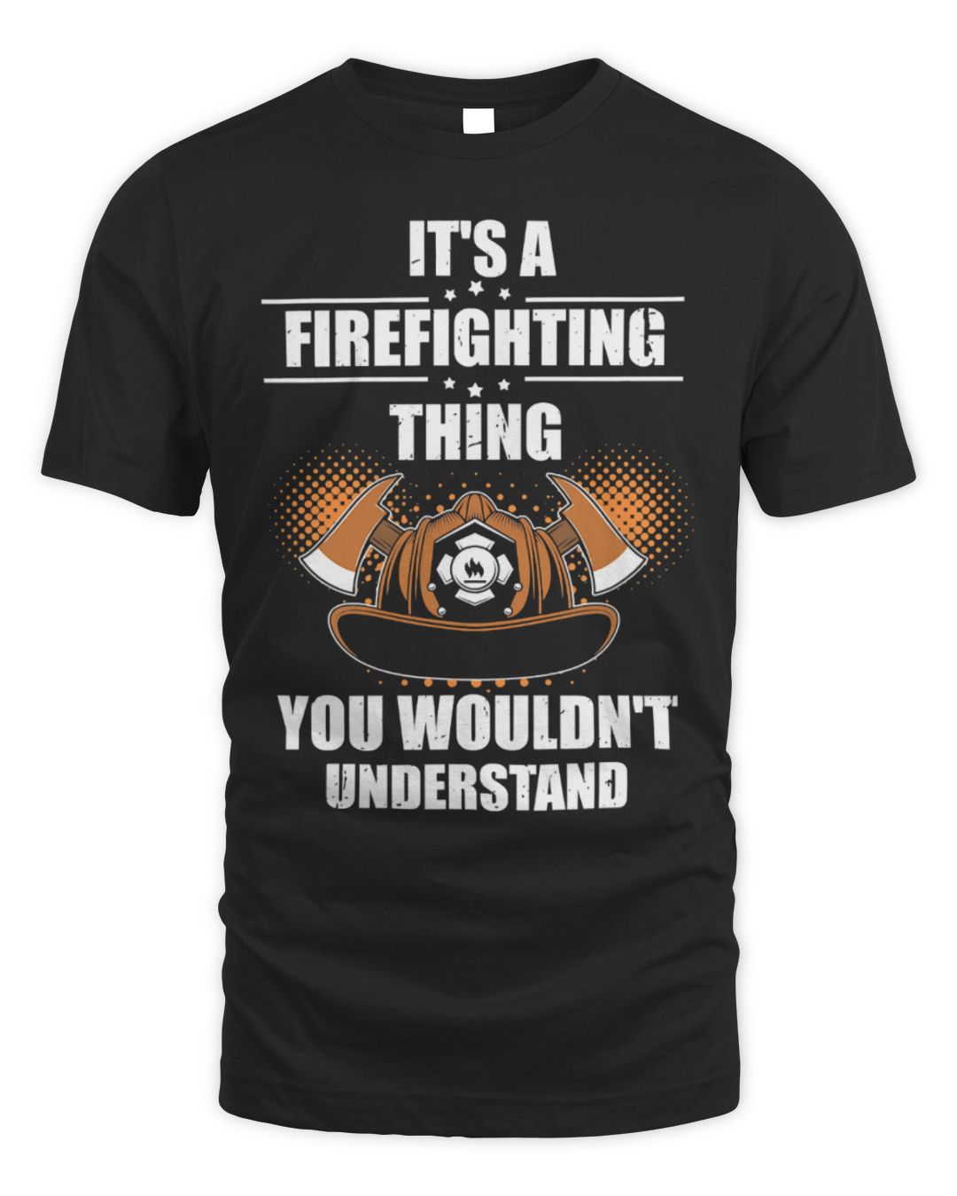
It's a Firefighter Thing You Wouldn't Understand
Unisex Standard T-Shirt
Straightforward lettering. The version most people mean when they search for this shirt.
$21.99
See details
3 designs of the same line, so you can pick the artwork rather than settle for the first one you find.
Straightforward lettering. The version most people mean when they search for this shirt.
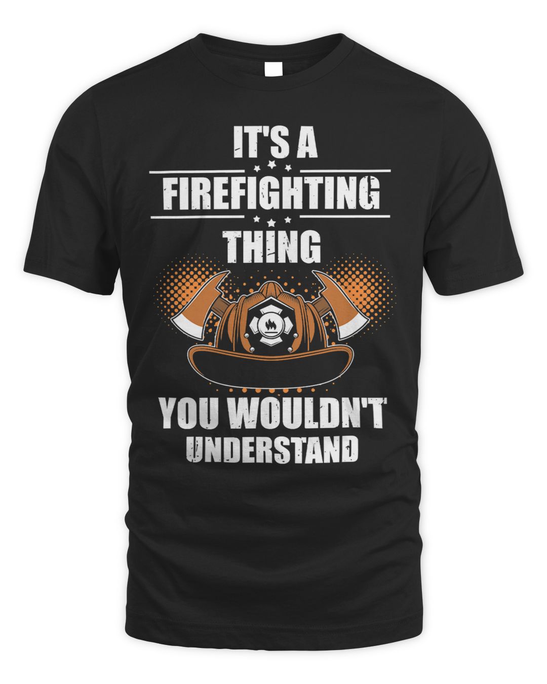
Fire-service artwork built into the design rather than text alone.
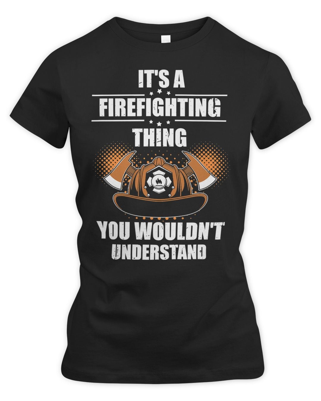
The same fire-service design on a slim-fit women's tee. Costs more than the unisex version because of the garment, not the print.
Trade and profession shirts are specific on purpose. Someone who says they are a firefighter will not accept a near-miss title, and the closely related jobs each have their own version — that precision is the whole point of the joke.
The 3 designs here all name the same job, so pick on how loud the artwork is. Anything worn to work should read cleanly at a glance rather than crowd the chest with a second punchline.
Best for someone a few years into the work — long enough that the job has its own vocabulary and its own complaints. For a new starter it can read as presumptuous, and for someone who has left the trade it reads as nostalgia rather than a joke.
Fire crews already own a lot of shirts, most of it from the station and most of it good. Anything you add has to be something they would have picked themselves, which makes this a harder gift than it looks.
The other thing outsiders get wrong is the ratio of fires to everything else. Most call-outs are medical, and every firefighter has explained that at least once this year.
Kitchen and gym jokes land better with crews than heroism does. They get enough of the second one.
The wording only works when it names the exact job, so it is worth checking before you buy. Fireman, Fisherman and Geologist each have their own page with their own designs, and there are more below.

Join the TeeDuck list — new trending tees, hoodies, and seasonal gift guides. No spam.
🎉 Thanks for subscribing! Check your inbox for fresh picks soon.